T-Mobile
- VISUAL DESIGN
- UI/UX DESIGN
- CREATIVE DEVELOPMENT
Driving Digital Performance Through Proactive Design
MY ROLE:
Sr. Visual Designer III
Year
2024-2025
CONTEXT
As a Senior Designer on T-Mobile’s Postpaid web team, my role extended beyond traditional design. In a lean, fast-paced environment, I served as a creative leader, translating high-level business goals into effective digital strategies. This required me to own the entire process, from design and content optim-ization to stakeholder collaboration and proactive workflow improvement. A key focus was designing for performance, ensuring every page update not only aligned with the brand but also drove tangible business growth by improving customer journeys and SEO.
STRATEGY
To maximize impact on projects like the “Bring Your Own Device (BYOD)” and “Back to School (BTS) Family Devices” pages, I developed a strategy centered on three core pillars: Audience & SEO Alignment, Customer Journey Optimization, and Proactive Process Leadership.
SOLUTION
The strategic redesigns of select landing pages resulted in significant, measurable business growth. These dedicated redesign efforts contributed significantly to a notable increase in organic non-brand search traffic to the T-Mobile website.
Beyond page redesigns, my proactive work with internal teams and systems led to two key solutions:
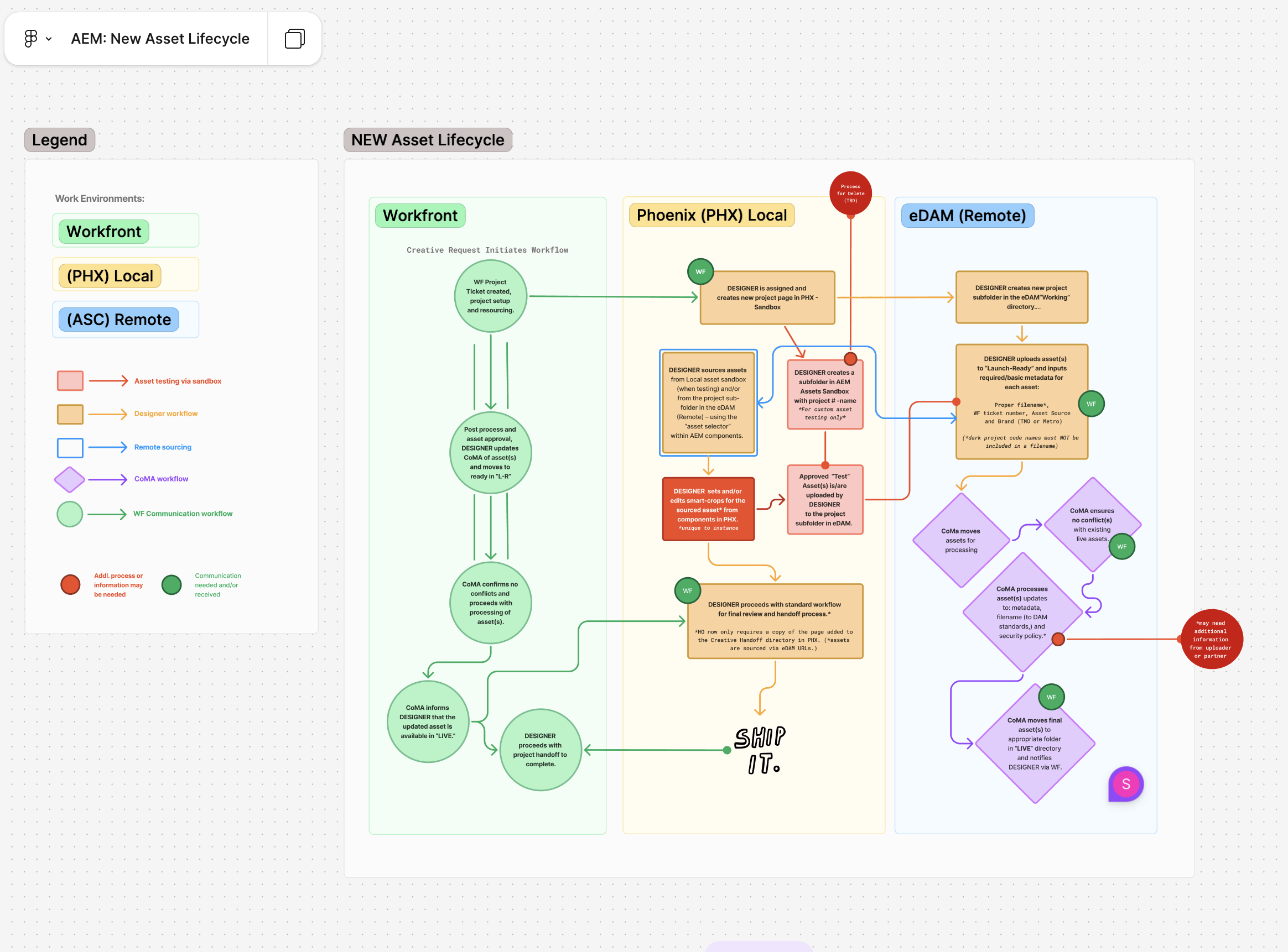
An eDAM Workflow, where I collaborated to establish a detailed asset lifecycle process.
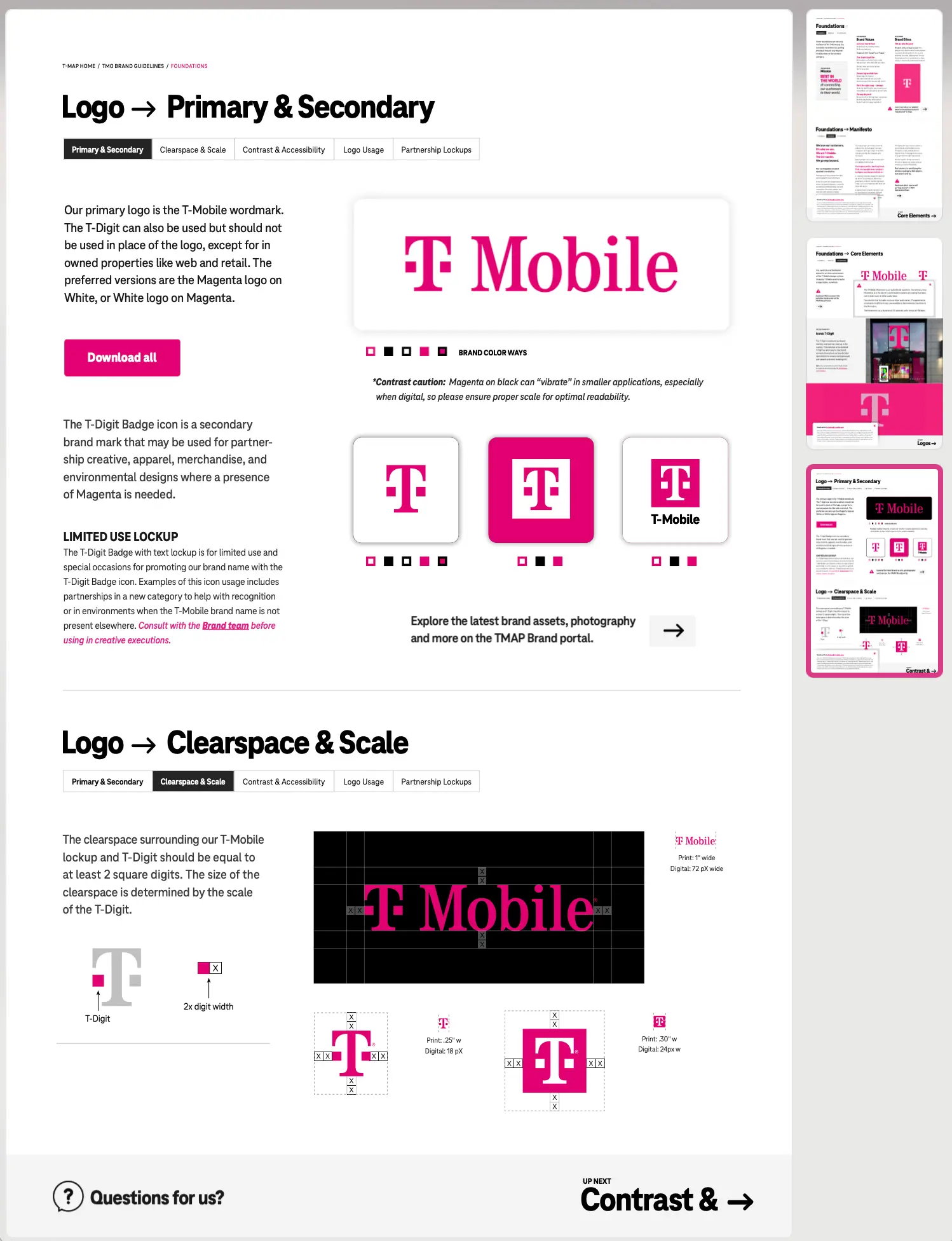
A Brand Guidelines Solution, where I identified a roadblock with Adobe’s implementation and proposed a solution using the Adobe Embed API.

Before:
Family Devices Landing
Page
Performance Issues:
#1
Confusing Content Lacking Clear Hierarchy
#2
Poor Scannability
Content Missing “Benefit-Focus”
#3
Unclear Customer Journey
Weak Calls-to-Action (CTAs) & Unclear User Path: The primary CTAs (e.g., “Add to Cart,” “See Details”) were inconsistent in design and placement. This created an ambiguous path to purchase, leading to high cognitive load and likely contributing to cart abandonment.
#4
Visual Clutter & Outdated Art Direction: The page was burdened with competing visual elements, low-resolution product imagery, and an inconsistent application of brand styles. This undermined the perceived value of the devices and diluted the overall marketing message.
Family Devices pg / AFTER
- Strategically redesigned the “Family Devices” page, eliminating extraneous sections and leveraging a “Back-to-school” theme to improve SEO and reduce page abandonment.
- Led a cross-functional redesign, collaborating with business and creative partners to champion an experience that delivered both a streamlined user journey and a cohesive brand narrative.
- Improved on-page performance and SEO by redesigning the previously cluttered page with more targeted content and user flow, while maintaining brand consistency.
Bring your own device "BYOD" / BEFORE
BYOD pg redesign / AFTER
Simplified User Journey: The new “Just a couple more steps and you’re connected” section is much cleaner and easier to follow, directly eliminating the confusion.
Improved Page Length: The page is significantly shorter and more focused, removing the clutter and distracting “deal” modules from the original design.
Strong Brand Alignment: The page feels more cohesive and polished, reinforcing the T-Mobile brand experience.
Interactive PDF Guidelines (API Solution)
AEM Asset Lifecycle Process +
eDAM inter-departmental workflow
COPYRIGHT © Pencilsandpixelsco 2025.
ALL RIGHTS RESERVED.
is proudly powered by WordPress